Data visualization is the art of storytelling, where data is the story and the visual elements are the medium through which it is conveyed. Choosing the right chart to tell your story can be a daunting task. Whether you’re a business owner, data analyst, or student, understanding the charts’ types is critical to communicating your message more effectively and making data-driven decisions. Let us explore 5 charts for effortless data visualization and analysis.
Types of charts
1. Pie Chart
A pie chart is used to represent data that can be split into a few categories, where each category is represented by a slice of the pie. It compares the proportion of each category within the whole.
These are useful when you have a total number that can be divided into 2-5 categories and when one category outweighs the other by a significant margin. However, pie charts should not be used when your data has too many categories, similar percentages or numbers between different values, data that doesn’t represent a uniform whole, or if the percentages don’t add up to 100 percent. When the chart has more than 5 slices, it may be better to use a different chart type, such as a line chart, to better compare multiple sets of data.
For example, this pie chart shows the proportion of total sales that each department represents.
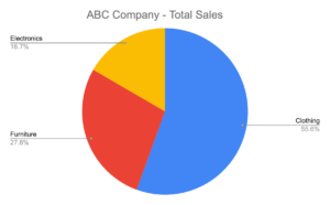
It allows the viewer to quickly see the relative distribution of sales across the different product categories and make decisions about which category is performing well and which might need more attention.
2. Bar Chart
A bar chart represents data in a graphical format. They are versatile and can show the relationship between values.
When creating a bar chart, ensure that the base of the chart starts at zero, which allows for an accurate comparison of the values. Use colors consistently, which helps to distinguish between different data sets and limits the number of bars on the chart. And try not to make each bar a different width, cram too many bars into subcategories and leave the axes unlabeled.
The following bar chart shows how a bar chart can be used to represent the performance of different stocks:
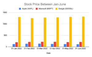
By looking at the chart, it’s easy to see that Apple stock performed worse than Microsoft and Google over the past year, with a lower price and more fluctuations in value. Microsoft performed better than Apple but not as well as Google, Google stock had the highest price and stability over the past year.
3. Line Chart
Line charts are useful for visualizing data that is measured in a continuous progression. They are particularly useful for tracking changes in data over a given period of time, as the line connects each data point and shows the progression of the data.
It is important to note that when data doesn’t follow a regular progression, like when the data is not time-series, or when there are too many lines or categories, a line chart might not be the best option. In those cases, alternatives like stacked bar charts, area charts, or scatter plots can be considered.
Here’s a line chart for the bank industry that could track the growth in the number of bank customers over a period of time.
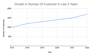
In this example, the line chart would show the progression of the number of customers from 1000 in 2017 to 1700 in 2022, with a clear upward trend. It compares this data to a goal or benchmark, such as the industry average, to see if the bank is performing above or below average.
4. Treemaps
In the treemap, data is organized as branches and sub-branches, represented by rectangles. The dimensions and plot colors of the rectangles are calculated based on the quantitative variables associated with each rectangle, making it easy to distinguish between categories and data values.
Treemap charts are ideal to use when there is a large amount of hierarchical data and space constraints when data needs to be studied with respect to two quantitative values, and when a quick, high-level summary of the similarities and anomalies within one category as well as between multiple categories is needed.
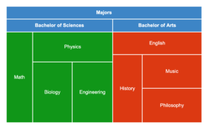
This is an example of a table with the number of students enrolled in different majors offered at a university.
| Majors | 55 | |
| Bachelor of Arts | Majors | 5 |
| English | Bachelor of Arts | 5 |
| History | Bachelor of Arts | 5 |
| Music | Bachelor of Arts | 5 |
| Philosophy | Bachelor of Arts | 5 |
| Bachelor of Sciences | Majors | 6 |
| Math | Bachelor of Sciences | 6 |
| Physics | Bachelor of Sciences | 6 |
| Biology | Bachelor of Sciences | 6 |
| Engineering | Bachelor of Sciences | 6 |
Here’s a treemap chart that represents the data in the table above. It makes it easy to compare the enrollment numbers of different majors at a glance.
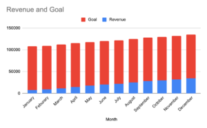
5. Stacked Chart
In a stacked chart, the different variables are represented by different colors or patterns, and they are stacked on top of each other to show how they contribute to the total value. This allows the viewer to quickly see the relative contribution of each variable to the overall total, as well as the overall trend of the data.
Stacked charts are often used to display data over time, such as changes in population, sales, or expenses. They can also be used to compare the contributions of different groups or categories to a total value.
For example, let’s say the company’s goal for the year is $0.1 million in revenue. The stacked graph quickly shows if the company is on track to meet its revenue goal.
Wrapping Up
The use of charts and graphs can make complex information more accessible and easier to analyze. Each chart discussed, has its own unique strengths and can be used in different scenarios depending on the type of data and the analysis required. By understanding the capabilities of each chart, you can effectively communicate your data.
Check out some other interesting blogs here :
Explore more blogs here.
Follow us on LinkedIN

 0
0