Introduction to AutoViz
Hello Data science enthusiasts,
Tired of typing multiple lines of codes just to get the meaningful insights using visualization tools like matplotlib,seaborn etc.
Today we are going to see a python library which is going to ease your work in just a few lines of codes.
There is a new contender in the data science space called “AutoViz” known as automatically visualization
AutoViz performs automatic visualization with just one line of code.
Only catch is, it works with CSV,txt and JSON files only.
How to install
For windows
pip install autoviz
For jupyter notebook and jupyter lab
!pip install autoviz
We are going to use the very famous titanic dataset to auto visualize with autoviz
Fire up your Jupyter notebook or Google colab
Let’s import the autoviz library
from autoviz.AutoViz_Class import AutoViz_Class

AV = AutoViz_Class()
This will import autoviz library
Now the magic happens!!!!!!!!!!!
We will visualize the complete data by just one line of code
We need to provide the filename and if you have a dependent variable provide it in the depVar attribute.
filename = "titanic_train.csv"

sep = ","

dft = AV.AutoViz(

filename,

sep=",",

depVar="",

dfte=None,

header=0,

verbose=0,

lowess=False,

chart_format="svg",

max_rows_analyzed=150000,

max_cols_analyzed=30,

)
From the data we will get multiple plots in the jupyter notebooks itself.
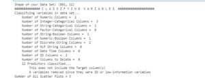
1st plot will provide us the summary of columns.
Number of interger,category, strin columns etc.
Autoviz will also tell us that whether we have provided any target variable or not?
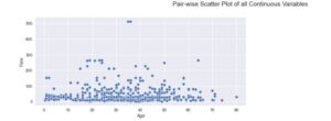
2nd plot will be of pair wise scatter plot of all the continuous variables. If we are having multiple continuous variables autoviz will create multiple pair wise plots. Here we have two continuous variables fare and age.
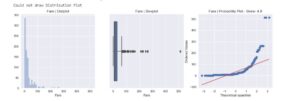
3rd chart will be the distribution plot of the continuous variables. Plot will allow us to find out outliers using boxplot and also we can find out whether the data is skewed or not?
4th Chart will be violin plot of all the continuous variables.
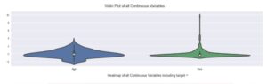
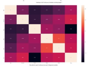
5th chart will be a heatmap correlation of all the variables correlation plot will allow us to find out collinearity of the various variables.
6th next chart will be visualizing the continuous values grouping by all the categorical variables. This will provide a meaningful insight.
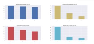
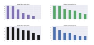
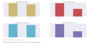
This is it with just a few lines of code you get some meaningful insights in your notebook. Amazing right?
Complete notebook can be found on my github repo
Official autoviz repo link – https://github.com/AutoViML/AutoViz
Click here to read more blogs.
Thanks and stay safe
Hunaidkhan

 5
5